2014 Gallery
Winner: Best Restaurant Design
Grant Cheyne Design for Rockpool est. 1989
New South Wales
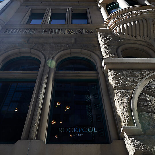
Relocation of Rockpool restaurant to new venue in Sydney CBD from former location in The Rocks where it was established in 1989.
Jury Citation
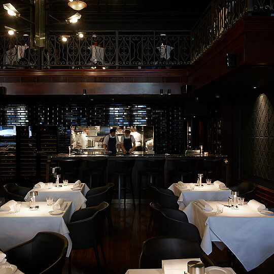
There's an almost monastic restraint to the design of Rockpool, Neil Perry's flagship restaurant, which relocated from Sydney's Rocks to the heritage-listed Burns Philp Building in the CBD in late 2013.
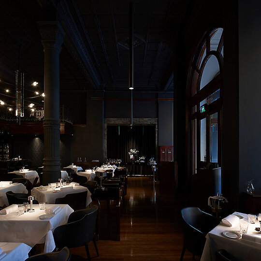
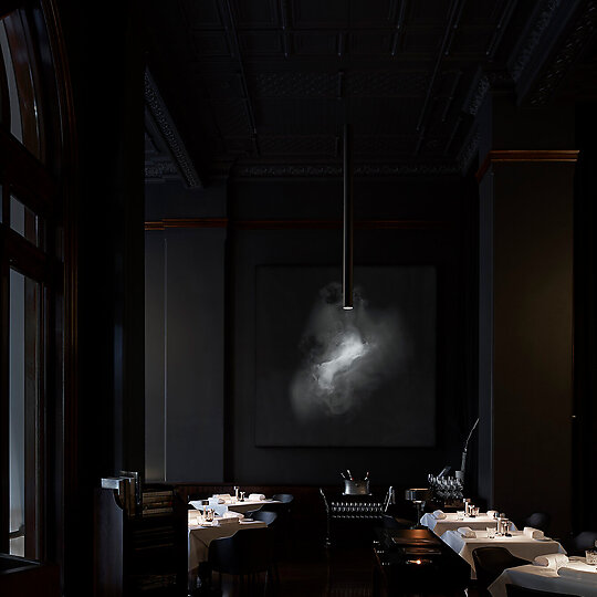
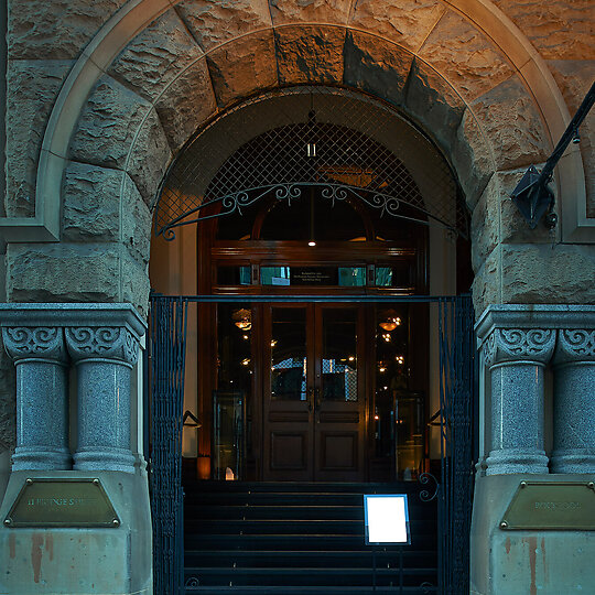
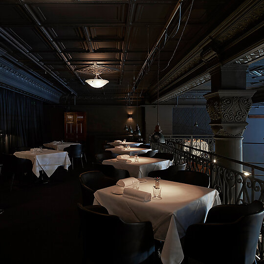
The beautifully crafted shell with its balcony-like mezzanine, ornate columns and ironwork, impressive arched, timber-framed windows that overlook Bridge Street and soaring ceiling heights has a wealth of natural and historic advantages.
But rather than trying to embellish on these, the design instead chooses elegance and restraint, a kind of visual silence that is something of a rarity in an era plentiful with imagery and ideas.
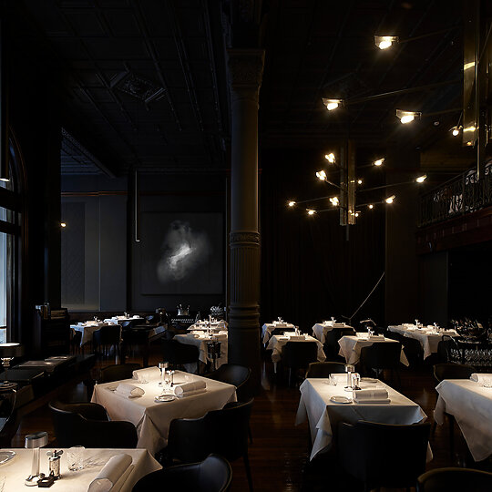
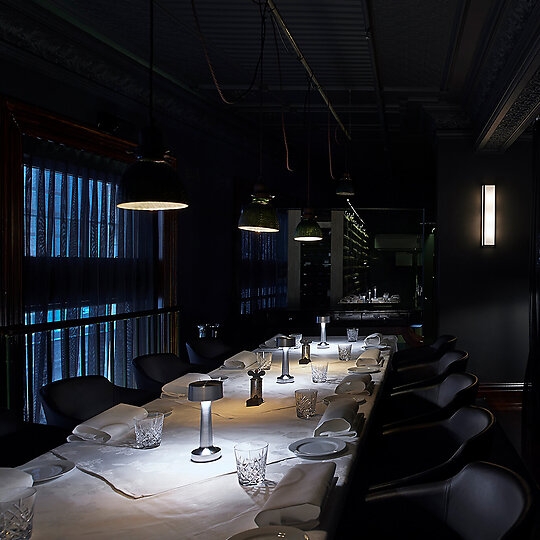
The black-on-black colour scheme is most dramatic at night when light is focused on the tables and parts of the room seem to disappear altogether, except for a glimmer of glazed tile or the shadowy texture of wall and column surfaces.
Yet while the design embraces subtle gestures, it still exudes a powerful sense of luxe occasion, something enhanced by the occasional dramatic flourish like the 3.5-metre custom-designed pendants suspended over the main dining space.
Add Perry's renowned food and Rockpool delivers one of Australia's great dining experiences.
DESIGN STATEMENT
Elegance, restraint and comfort. We are at times overwhelmed in an era plentiful with imagery and ideas. Designs can compete to capture our attention using bold gestures, colours, complex geometries and remarkable details.
The fundamentals of design are not forgotten but they can slip down the list of priorities in response to client demands or preoccupation with appearances and promotional photos. In such an environment where is there place for a classic and refined dining experience such as Rockpool?
By consciously holding back and focusing on three simple but essential qualities, the adaptation of a heritage space in the Sydney financial district aims to create an elegant, comfortable and restrained atmosphere to complement the cuisine and service.
Such qualities are neither inventive nor special but it is rare to find them all in the same restaurant. Consequently some aspects of the design are simple and unremarkable, like commonplace finishes or imperfect residual elements from past uses.
Inversely great care and investigation preceded the selection of dining chair and the lighting of the tables or the creation of a new visual identity for the restaurant.
Aside from this, I concede that dining at this level is a special event and indeed the site was selected with this in mind. Features such as the 3.5-metre-high custom-designed pendants are both a celebration of the magnificent heritage building and a reference to the grand restaurants of the past.
I anticipate that we are nearing the end of the iconic design trend and resuming (yet again) to rediscover enduring classic design and the essentials of what makes a space great.
